Project Details
Successfully pitched and secured buy-in for a proof of concept (POC) to redesign the desktop dashboard and navigation, enhancing user experience and aligning with strategic business objectives
-
ClientSuryoday small finance bank
-
Worked asUX Designer
-
Duration5 Days
-
PlatformsWebsite
My Role
About the client
Suryoday Small Finance Bank Ltd. focuses on social inclusiveness by providing tailored banking solutions to the banked, under-banked, and unbanked. Committed to a customer-first approach, the bank aims to make banking easy and beneficial for all through intuitive and accessible features.
The Brief
“To Redesign the Suryoday Small Finance Bank website to better serve its diverse customer base, ensuring accessibility, usability, and a modern aesthetic.”
The Process
Agile Planning
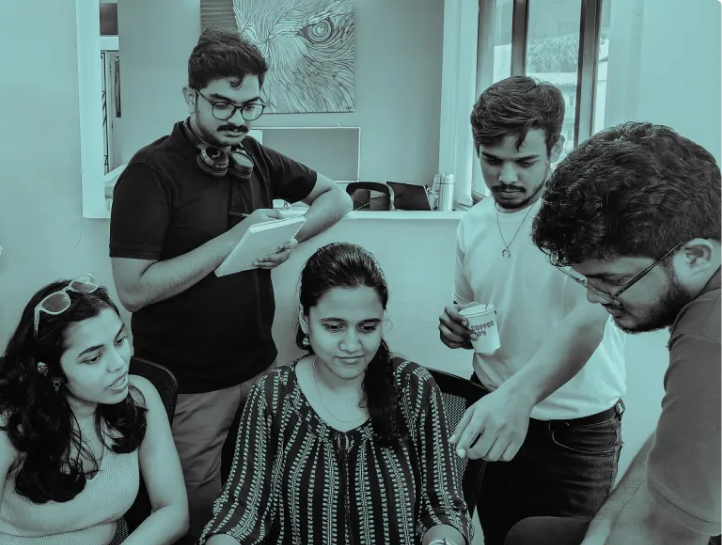
Faced with a three-day deadline, our team of five adopted a swift and flexible approach to manage the project efficiently.
Rapid Design Audit
We conducted a quick yet thorough evaluation of the current website to pinpoint key issues and areas for improvement.
Secondary Research
To save time, we leveraged the bank’s annual report and other existing documents to gain insights into its vision, mission, and strategic goals, bypassing the need for time-consuming primary research.
Focused Problem-Solving
By understanding the most pressing pain points and business objectives, we were able to align our design concepts closely with user needs and the bank’s strategic direction.
Key Pain Points
A quick yet thorough evaluation of the current website was made to pinpoint key issues and areas for improvement.
- Outdated Layout
- Cluttered Module Placement
- Reduced Findability of Products
- Lack of Brand Guidelines
- Low Market Awareness
- Uninformative Landing Page
(3 Days x 5-Person Team )+ 2 Major Challenges
= 2 Outstanding Concepts + 1 Successful Client Buy-In
Design Concepts
We had developed 6 concepts to address the major pain points. The client proposed merging three of these concepts to create the final design.
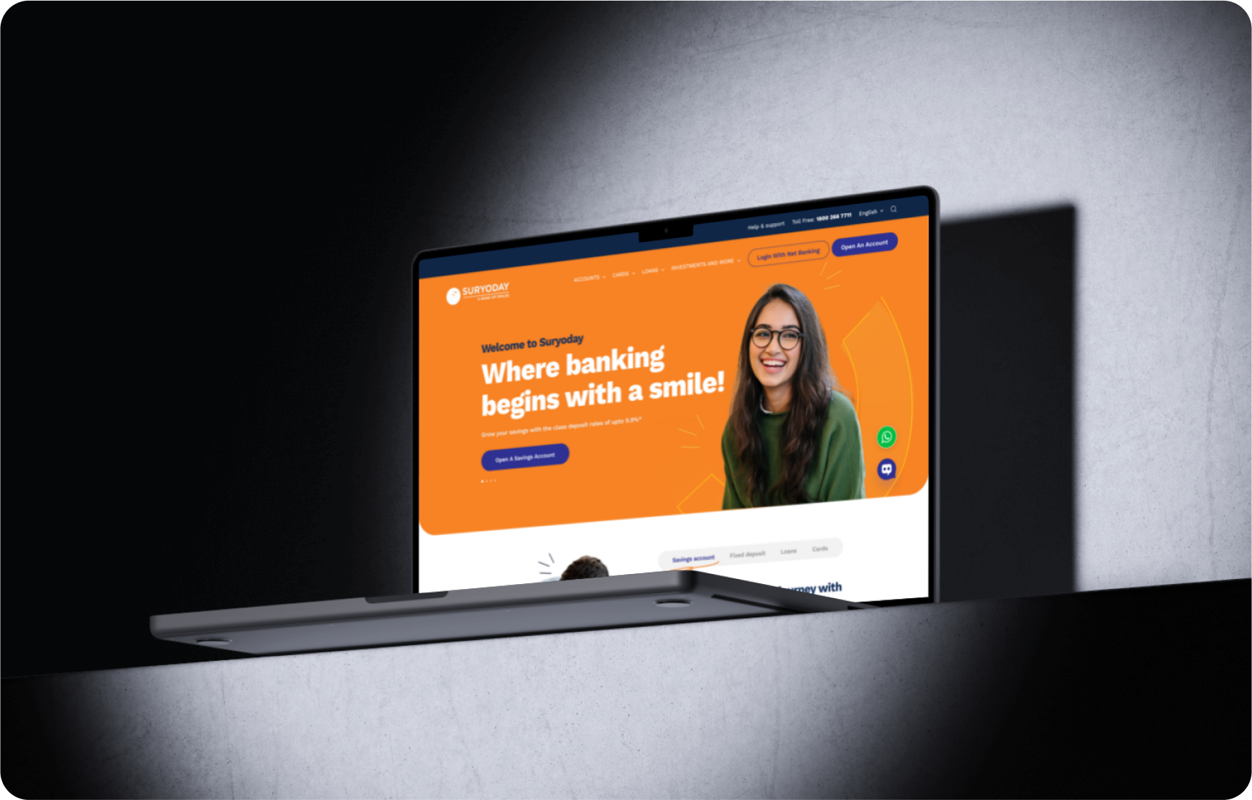
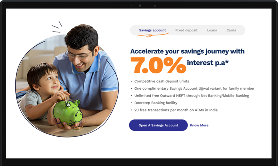
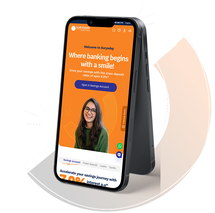
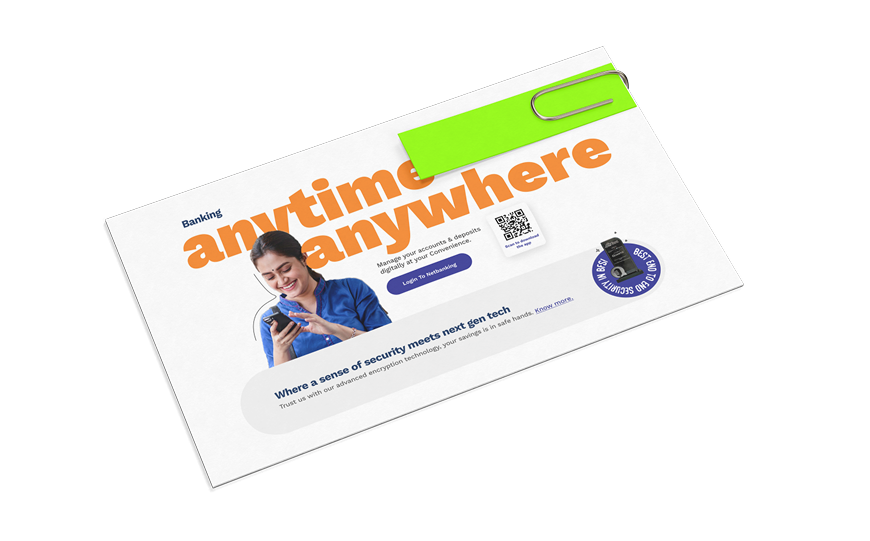
Bold Bright Visuals
Suryoday wanted to be presented as a bright, friendly, welcoming brand. Vibrant colors create a welcoming atmosphere, making the site feel approachable and friendly, boosting user confidence.
Big, Readable Fonts
With a broad, diverse audience, accessibility was key. Large fonts enhance readability, ensuring important information is clear and easy to access, especially on mobile.
Prominent Use of Trust Marks
Trust-building was essential to make new users feel secure. Elements like the “Safe with Suryoday” badge and app store icons reinforce credibility and foster trust in the bank.
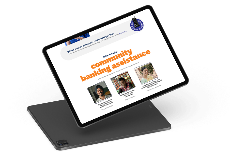
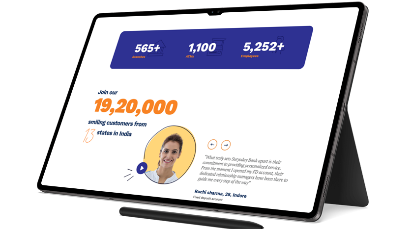
Human-Centric Imagery
Research shows users feel more secure when they relate to other customers. To emphasize this, diverse images highlighting the bank’s inclusive, community-driven approach were used